
Studio Contrast
Ideas, made visible.
Identity, editorial and digital systems. Four studies in how visual form can make content easier to understand.
Explore the studiesHow we approach a briefSelected studies / 01—04
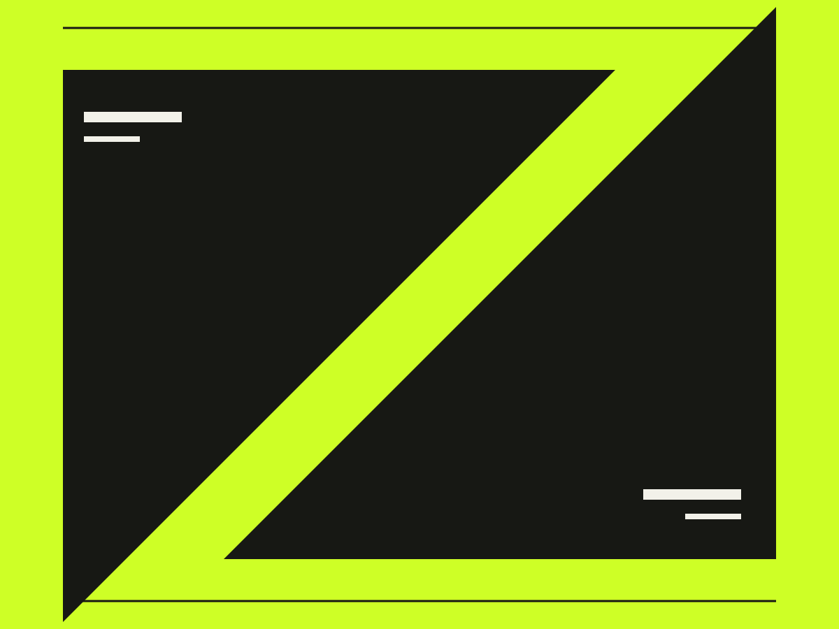
01 / Signal
An identity study built around one line that changes direction.
The brief: make a small programme of public talks recognisable without relying on photographs. A diagonal cut provides the basic unit; changes in scale distinguish a poster from a timetable. The study includes a mark, a two-colour poster and a compact usage sheet.
Identity / concept study
2026
 Read more
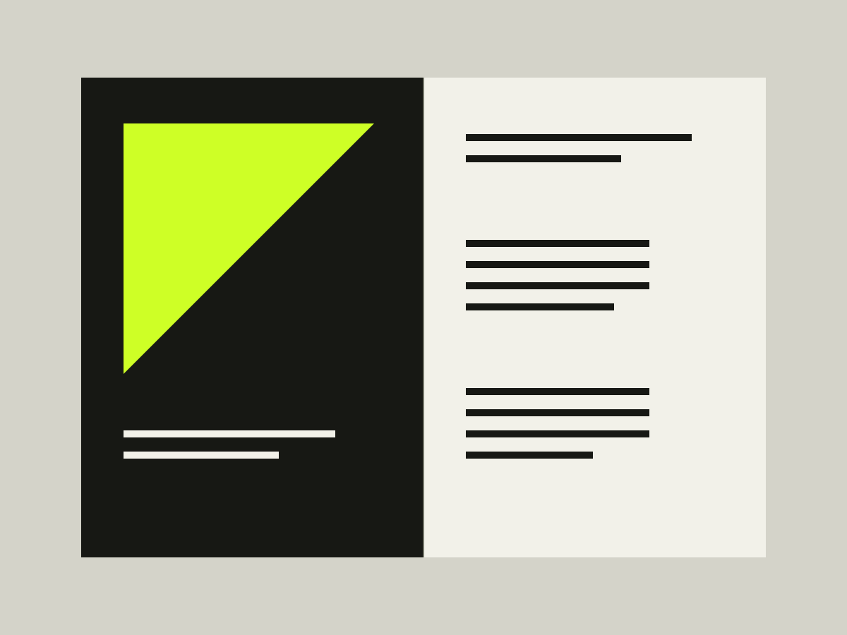
02 / Margin
A reading system that gives long text room to breathe.
A journal layout for exploring long-form rhythm. A wide outer margin holds captions while narrow rules organise the contents. The study covers a cover, an opening spread and a mobile contents page.
Editorial / concept study
2026
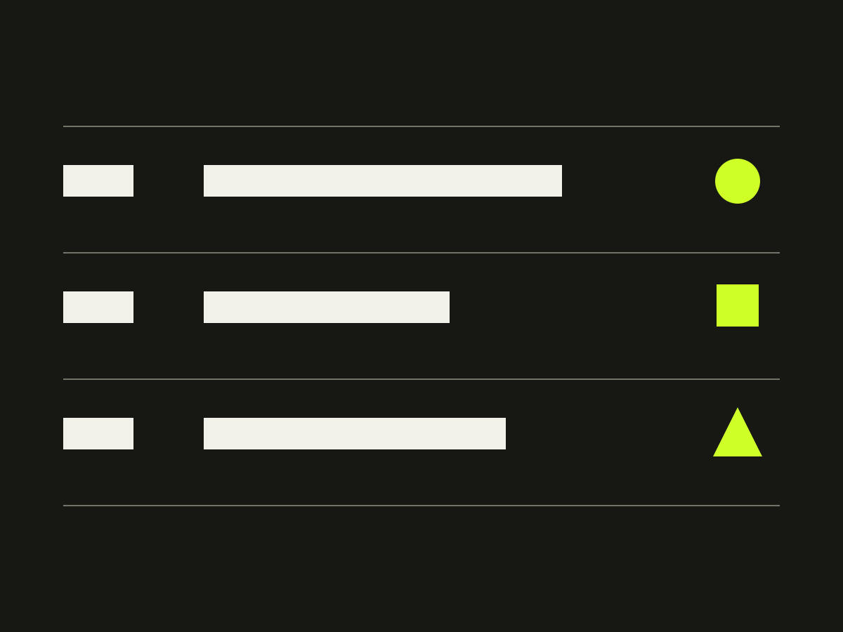
03 / Interval
An event index with a deliberate pause between entries.
A self-initiated interface exercise for an invented programme of listening sessions. The design separates time, title and location instead of putting everything into identical tiles. A single-column reading order remains intact on a phone. No events, bookings or organiser partnerships are offered.
Digital / concept study
2026
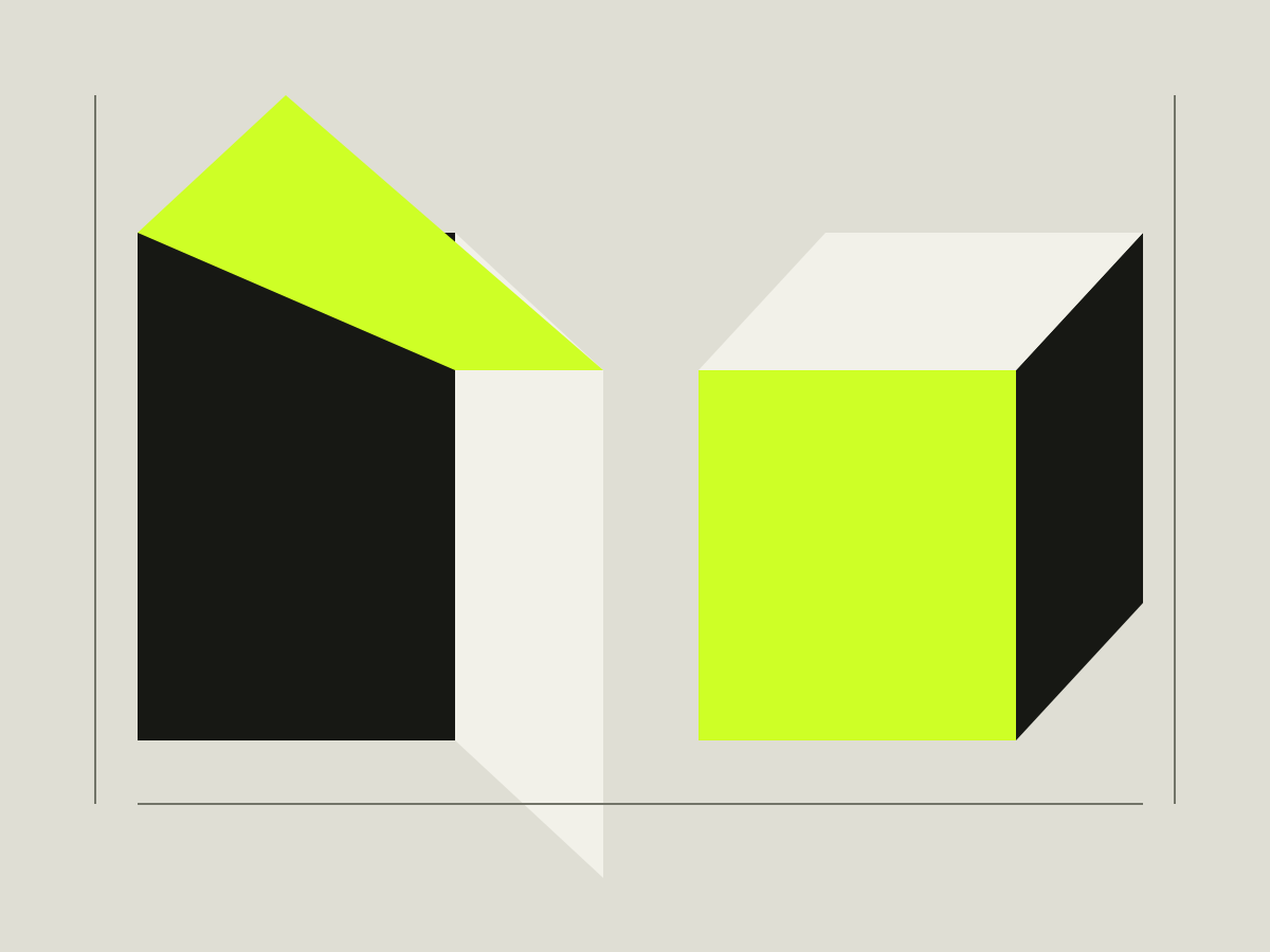
04 / Fold
A geometric packaging study, without a product claim.
An original paper-form exercise testing whether a folded corner can act as both structure and graphic sign. Flat vector plates show three arrangements. There is no manufactured product, environmental certification or commercial client behind this study.
Graphic system / concept study
2026
Less decoration. More direction.
A useful visual system starts with a decision: what needs to stand out, and what can stay quiet? Here, scale does the talking; a precise grid holds it together.
Start with a better question.
Define the task, audience and constraints before choosing colours or type.
How to write a brief